One of my favorite quilt shops, Red Rooster Quilts, is hosting a Customer Challenge Contest using the 2019 Pantone Color of the Year…Living Coral.
The challenge is to use one fat quarter of Living Coral and one other fabric to make a Mini Quilt that is 20 inches square or less. Needless to say, challenge accepted!
I decided to pick my fabrics first and then work on a design. I’ve been interviewing fabrics from my stash and definitely need some advice.
A. Is this plaid too dark?

B. Are these polka dots too big for a mini quilt?

C. This might make a modern mini, but what about this pattern…too busy?

D. Who can resist a paw print? Go or No Go?

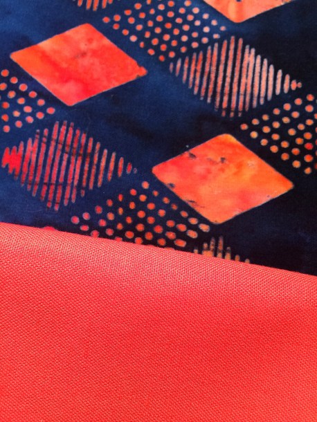
E. This makes things bright!

F. Nautical meets living coral…hmmm

G. These mini dots are cute, but what about the color?

H. Color is nice, but is this print too large?

I. This is a pretty floral print, is it too busy for a 2 fabric mini?

J. This batik is interesting, I’ve always liked it.
K. This print might be too big for a mini…what do you think?

What combinations do you like?
What other colors work well with Living Coral?
All of your combinations are good (except maybe the mini dots IMHO), but it is the design of the quilt which should dictate the scale of the other fabric. I love the last option, but not if you are making small blocks.
Thanks, Meg…good point about the quilt design…maybe I should have started with the design first! Which comes first, the chicken or the egg?
I like C, H and J, just because each one is so different. Maybe play a bit with green, purple or aqua/teal? Kona Splash is a color of the year too, wonder how that would play with this one?
Kona splash…that might work! Thanks for your input, the colors you use in your quilts always provides me with inspiration.
Aw, thanks! Same here!
I personally li.e E and I best. Maybe it’s the contrast
Yes, I like the contrast as well…color choices always provide me with a challenge. I’m always second guessing myself. Thanks for helping to narrow things down!
What fun! All the combinations work, but my favorite are B,C, D, and K. I didn’t think I was going to like the Living Coral, but it is growing on me.
Thanks, Chela! C is becoming the front runner. I agree with you on the Living Coral, it’s growing on me. It reminds me of Florida and the beach, but not a color I gravitate to.
I like “I”– coral and aqua or coral and teal are in my top 5 color combos!
Thanks! It looks like I and C are the front runners in this color challenge.
Love the batik combo!
Me too! It’s bold and bright…kind of like us!
Wow – some stash you have, with great choices. I always think of the color wheel first for direction. Directly across is blue-green. What one speaks to you? I love D the paw prints (last post is why), E is happy looking and springy, and K is striking. But I’d go with whatever you envision – and what modern means to you. I have to throw in A because it’s so subtle. Happy Thursday to you. ~smile~ Roseanne
Thanks, Roseanne! It’s always a challenge for me to narrow down fabric/color choices…I’m thinking I should have started with 3 fabrics…it might have made picking a final fabric easier!
I am jealous of your stash….
Haha and I’m jealous of yours! Let’s trade!
I am so in to this! Thanks for the info. I am likely going to pair Living Coral with navy.
Thank you for weighing in, Danice! I do like the living coral with navy, I think it’s a nice contrast.
I’ve narrowed it down to three viable options (based upon finished size of the piece as well as personal aesthetics):
E if you’re in a ‘bright’ mood, the scale, color palette and design work for me
F fits the bill for a ‘contrast’ effect with a subtle ‘theme’ fabric (seemed like you were attracted to the contrast effect with the number of darker selections presented)
J if you’re in a ‘managable modern’ mood with a contrast effect, the scale, color palette and design work for me
Good luck!
Well, it looks like E is now the front runner…I am going to make a decision today…honest! Thanks for your comments, I appreciate the help!
I personally like the darker colors with the coral. I do like the black with the dots but you are right they might be too large on a mini. From there I would see either the dog prints or the anchors.
Yes, I have ruled out the black and white dots. I must admit, I am partial to the dog print but like the anchors, too! This shouldn’t be so hard…maybe I should have started with a pattern?
I really like “I”. Love those combinations. But, I also do like E which you pointed out was the front runner so I took a look back at that one.
Have you seen this page for the color of the year and 4 different groupings of colors which go well with the 2019 color of the year
https://www.pantone.com/color-intelligence/color-of-the-year/color-of-the-year-2019-palette-exploration